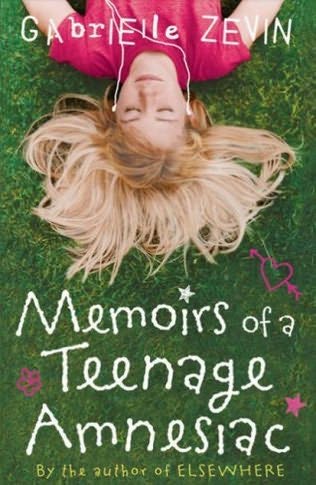
 I love the cover of Gabrielle Zevin's Memoirs of a Teenage Amnesiac. While the cover design doesn't really give you much of an indication as to what the story will be about, it is very pretty to look at. And anyway, the title Memoirs of a Teenage Amnesiac sums up what the book is about nicely!
I wish my hair fanned out like that. Doesn't it make you want to g
 o lie out in the sun?
The book was also printed with a different cover, typewriter keys. Which is probably more fitting to the story but not as please to my eyes.
Which cover do you prefer?


I think I prefer the cover with the girl. I wish my hair fanned out like that too. It's too short, however.
ReplyDeleteI think they're both beautiful, but I have a thing for typewriter keys...
ReplyDeleteSometimes I do judge a book by its cover. I almost bought Why I Let My Hair Grow out by MaryRose Wood for its cover alone, and then I found out she's an awesome writer in general:
http://www.amazon.com/Why-Let-Hair-Grow-Out/dp/0425213803
I actually like both...maybe the typewriter keys slightly more.
ReplyDeleteI haven't read the book, but I like both covers. The title sounds a little more heavy, though (then again I don't know because I haven't read it), so I'd go with the typewriter keys. This is definitely on my TBR list, though!
ReplyDeleteI like the first cover more it's so much prettier I gotta say
ReplyDeleteI still haven't gotten around to reading this book, I really should especially since I really liked Zevi's Elsewhere.
hey, I see you're reading Q&A, I hope you like it, I LOVED it!!
Have not read it but I LOVE the typewriter keys. I would no buy the first book. I would buy 10,000 copies of the second.
ReplyDeletePretty pretty covers. Personally, I liked the keys more than the girl. Although, I also wish my fanned out like that!
ReplyDeleteAlso, I tagged you in my last blog. http://caprubia.blogspot.com/2009/01/bookshelf-meme.html
: )
Sun? What sun?
ReplyDelete(Although I would like to say, I have long hair, lol)
The first cover (girl with hair fanned out) has a better feel for the title. I like that one. :)
ReplyDeleteI like the cover with the girl in it! The colors are cool!
ReplyDeleteI like the darker cover; the one with the girl in it makes it look more chick-lit-y, and the other one looks more like a book I'd be likely to pick up :-)
ReplyDeleteThank you for making this site very interesting! Keep going! You're doing very well!
ReplyDeleteUK Writing
Good writing usefull content and beautiful theme, I like it.
ReplyDeleteHire UK Writer